ART DIRECTION • NAMING • LOGO DESIGN • BRAND GUIDELINES
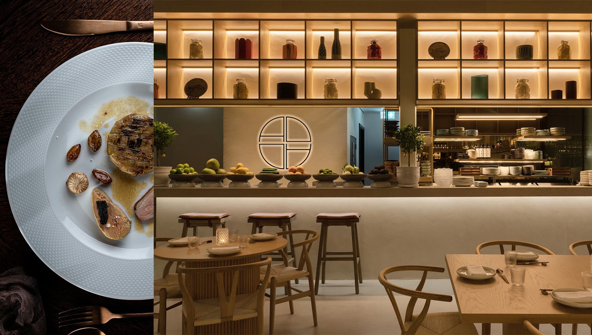
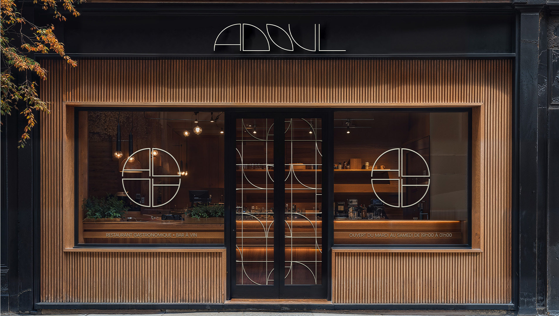
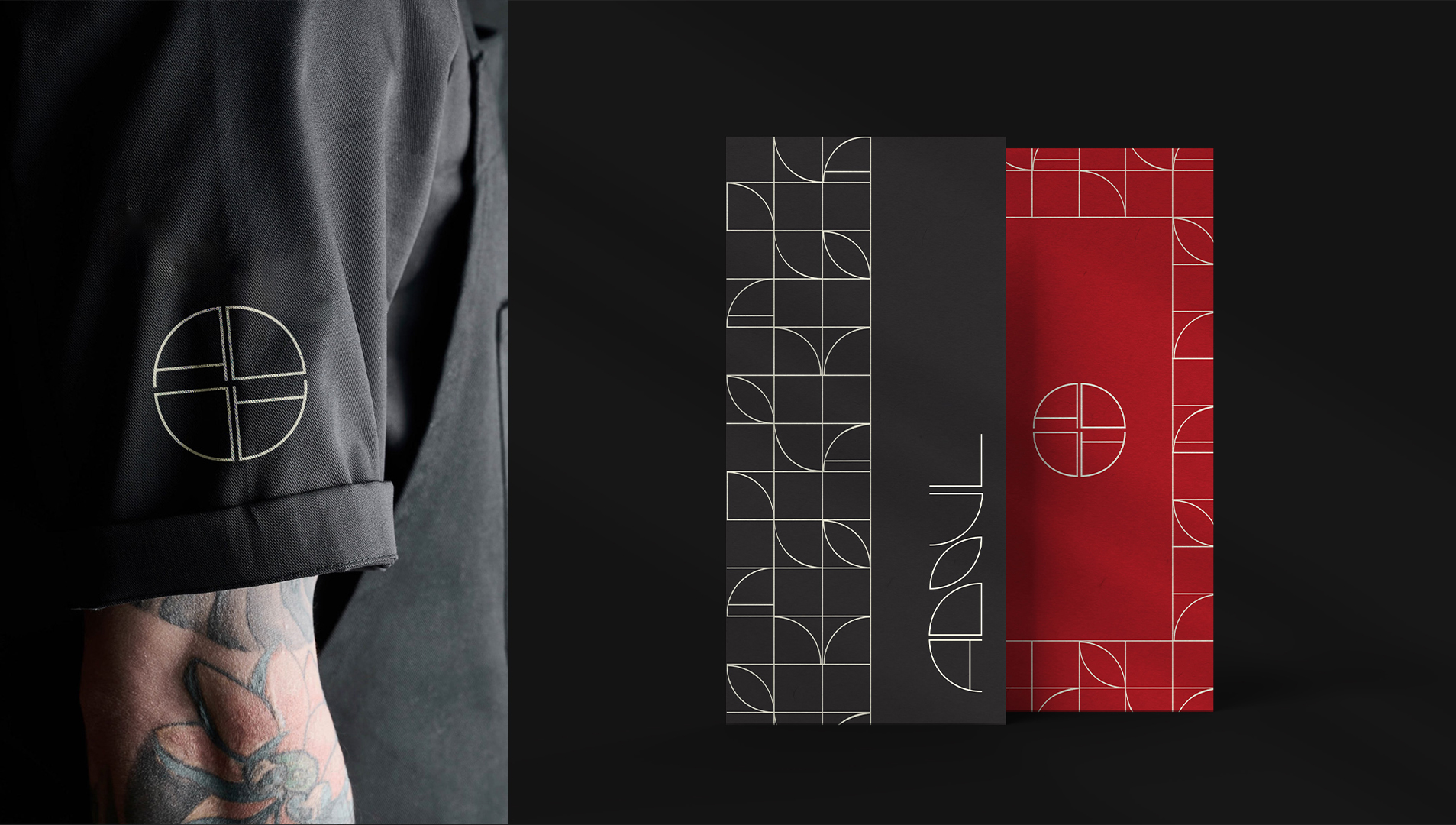
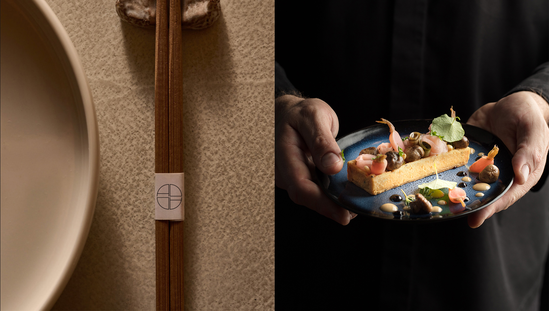
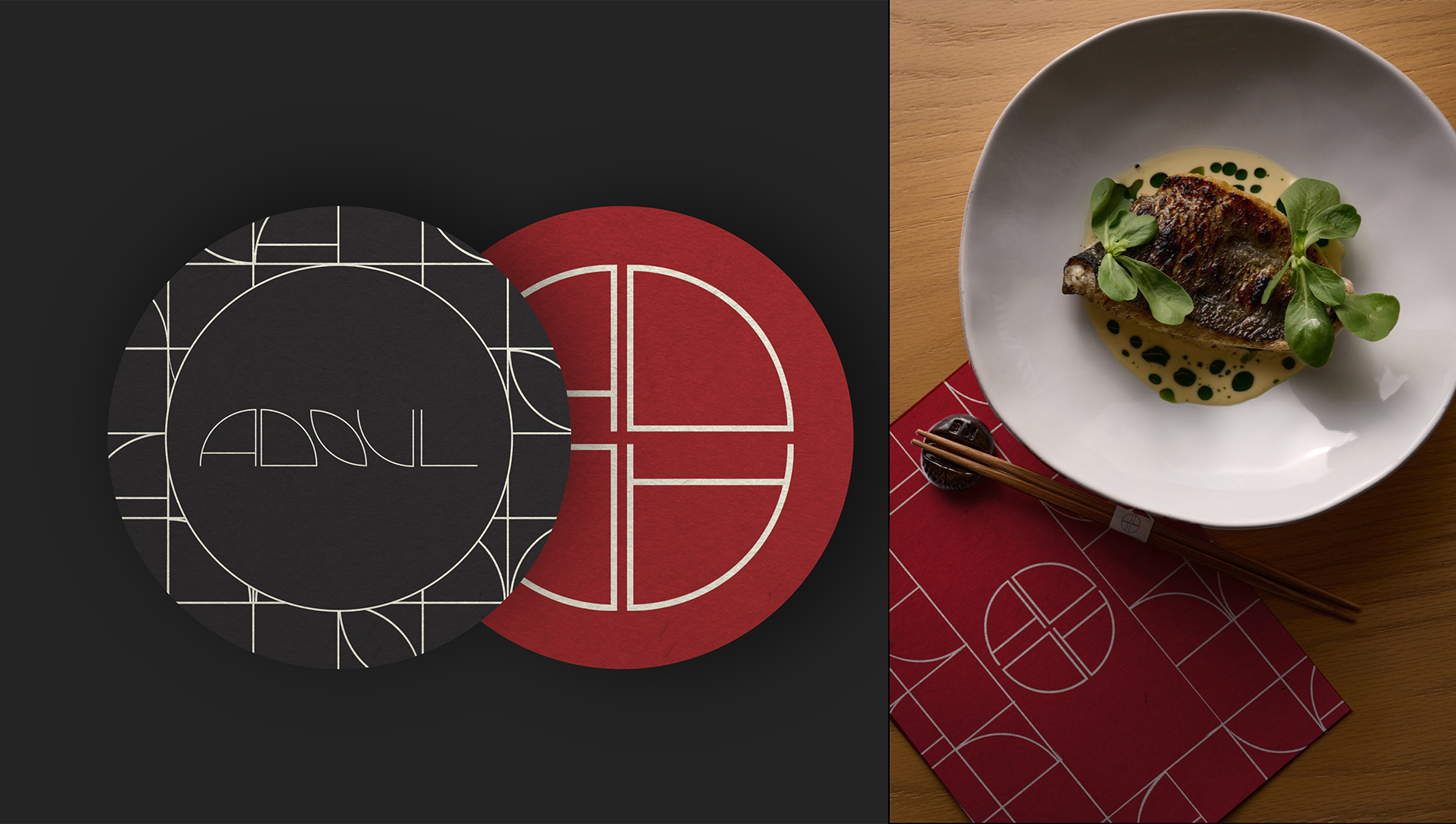
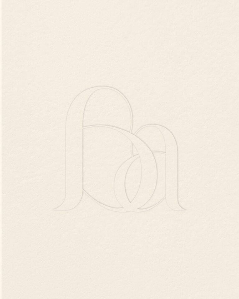
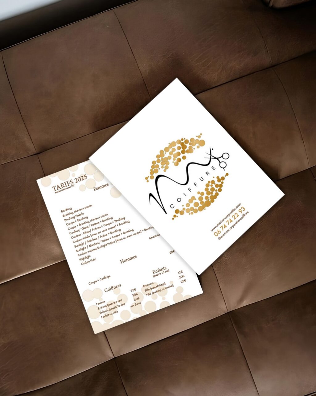
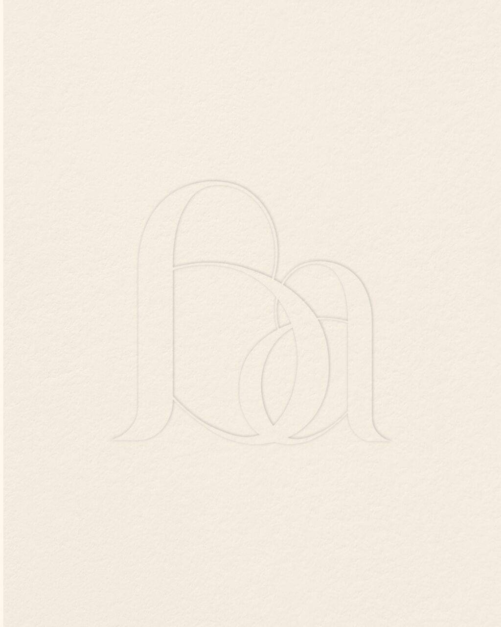
For the creation of the ADOUL brand, the logo draws inspiration from both the first and last name of our client, as well as Japanese culture. For this project, we adopted a minimalist approach, leveraging the clean and understated aesthetic characteristic of Japanese art, while incorporating rounded shapes that evoke the softness of their writing characters.
The typography, custom-designed for this project, is inspired by the lines and curves typical of Japanese art and typography, creating a balance between elegance and simplicity. The circular icon subtly references a plate while also suggesting the idea of a restaurant table, thereby reinforcing the connection to the culinary world.
Notre site internet utilise des cookies. Certains de ces cookies sont nécessaires au bon fonctionnement du site et ne peuvent être refusés lorsque vous visitez ce site. Les autres améliorent l'expérience utilisateur et nous permettent de réaliser des statistiques de visites. Nous vous recommandons d'accepter leur utilisation pour profiter pleinement de votre navigation.
Ce site Internet utilise des cookies pour améliorer votre expérience lorsque vous naviguez sur le site Web. Parmi ces cookies, les cookies classés comme nécessaires sont stockés sur votre navigateur car ils sont essentiels pour le fonctionnement de base du site Internet. Nous utilisons également des cookies tiers qui nous aident à analyser et à comprendre comment vous utilisez ce site Internet. Ces cookies ne seront stockés dans votre navigateur qu'avec votre consentement. Vous avez également la possibilité de désactiver ces cookies. Mais la désactivation de certains de ces cookies peut avoir un effet sur votre expérience de navigation.